Tuesday, November 30, 2010

Amnesty International Poster

A proposed design for an anti-torture poster supporting Amnesty International.
This was drawn in charcoal, pencil and pen before combining several elements digitally.

Julian Assange


Here is an image for a proposed article on Wikileaks founder and mouthpiece, Julian Assange. International hero or some kind of irresponsible villain?

More backgrounds

Here are a few more of my recent backgrounds of interiors and bush scenes.


These two interiors have a similar colour palette and technique, which is quite different from my other backgrounds.


This last bushscape is pretty dense with grass and leaf texture.
I am getting a lot of good feedback on the tough little koala character.

Thursday, November 11, 2010

Suburban scapes Post #1

So this semester I carried on with more digital background images. This time I was trying to make more of them surburban and urban than bushscapes, although I did a couple of those too.

I also added some characters at the very end, I think they help focus the images a bit although keep in mind the background is the point not the characters. Maybe they are a bit too distracting.


The hard bit about adding buildings and man made objects is that suddenly perspective becomes a big issue. It isn't too apparent in the bushscapes but all the angles have to line up to some extent with a building or it just doesn't look right. So I drew and redrew the house above and pushed the perspective more each time to make it more cartoony and fun.


I also added a character to this bushscape and I really like the character, he's a goanna.

Bushscapes Post #3

Bushscapes- Some final images

I ended up doing 8 final images and you can see a selection of them below.
I found it hard to keep them stylistic and had to fight the urge to tighten them up and add too much detail.

I learnt a lot in making this first image, it went through several stages and helped set up the process properly.


This next image started off as a daylight scene and quite realistic, after several hours I dumped it all and began again with just a few simple stylised shapes and a much more interesting colour palette.


Here I also started with quite realistic colours and towards the end I changed it all to a weirder, Venusian palette.


Simple colours and strong graphic shapes seemed to work better, realism wasn't that important. Here I tried a raking sunset light hitting scribbly trees on big rolling hills.


I liked the raking light idea so I used it again on a simpler landscape with large empty grassy areas and detailed grass brushes in the fg.


This is a more realistic and carefully painted scene. I like the textures of the fg grasses and shadows. I was trying to get the feeling of distance with aerial perspective and that fence line leading the eye down past the dam and into the distance.

Bushscapes Post #2

Bushscapes 2 - Experiments

Having decided to use this idea as one of my proposals in my studies I did further research and tried a lot of different techniques.

Here I have used a much more painterly approach in Painter.


I started this with a very quick Painter wash then added the trees with a single photoshop brush, same for the grasses


I tried lots more stuff with grasses to get the foreground looking better and work on the colours a little more.


I gathered a lot of photographic reference to help make the brushes. But as you can see here it didn't really work. It was all too specific and hard edged, and gets a bit too same-samey.


The Photoshop brush technique really wasn't working I needed more variation in texture and edges so I moved on to primarily using Corel Painter.

This proved much better as I could put specific textures in the paper surface and spray elements on with the image hose. It gave it a much more random and less mechanical look.


The results were encouraging, it was time to get into the final images...

Bushscapes Post #1

I am going to move this post from my old blog, just so that you can get up to speed on what I have been working on lately.


Bushscapes 1 early ideas

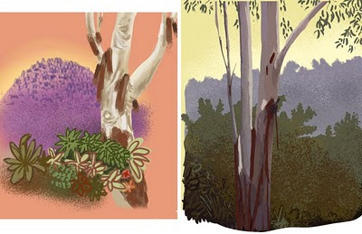
One of my big projects last semester was working on a technique to help me generate Australian bush landscape pictures, digitally.

They are supposed to be for use as animation or game backgrounds, maybe even backgrounds for kids books, etc.

I think these ones are still a bit too detailed, so I will have to work more at trying to keep them simple and more stylised.

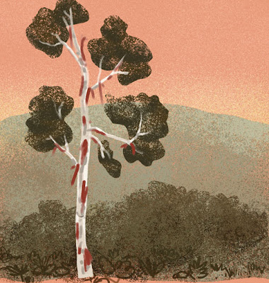
I started thinking about this late last year and took some early directions from the Hanna Barbera cartoons of Yogi Bear & The Flinstones as seen on John Kricfalusi excellent blog John K's Stuff.

Note the orange skies and such simple foliage.


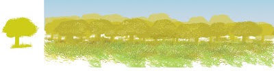
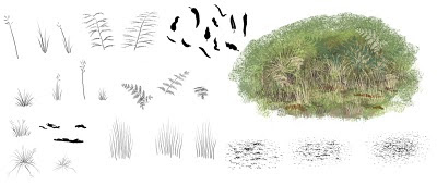
Then I tried using making some photoshop brushes, like this one of just one tree used over and over and a few grass brushes.


Here are several of my first brushes to get that scrubby bush look.


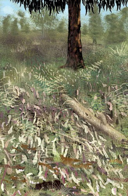
And using those brushes I made this image which I was pretty happy with as it only took about half-an-hour.

Finishing School


With only a few days to go before I finish my 3 year Bachelor of illustration course I thought I should get a few posts up showing some of the work.

I will be putting stuff up throughout the summer and into the new year as there is quite a few images after three years.

Here's a zombie fashionista to start with...

Saturday, November 6, 2010

Sunset near the tram stop


Just testing the upload image functions. Here is a vector image from near my house. Beautiful urban complication

The new blog

Hi and Howdy!

Welcome to my new blog. I will be phasing out my old one and concentrating on this one from now on. It might take a few weeks to really get going as I am wrapping up my final assignments in the 3 year Bachelor of illustration course at NMIT Fairfield. In fact this blog and my new website are part of the course.